CLIENT BRIEF
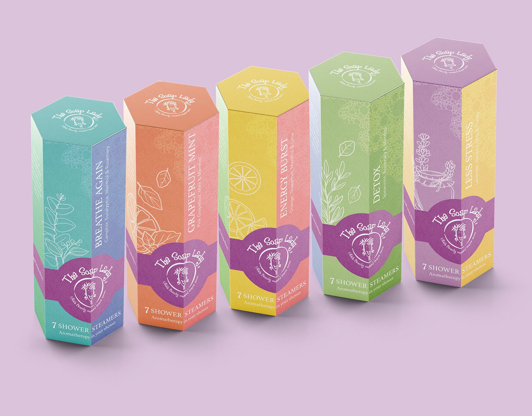
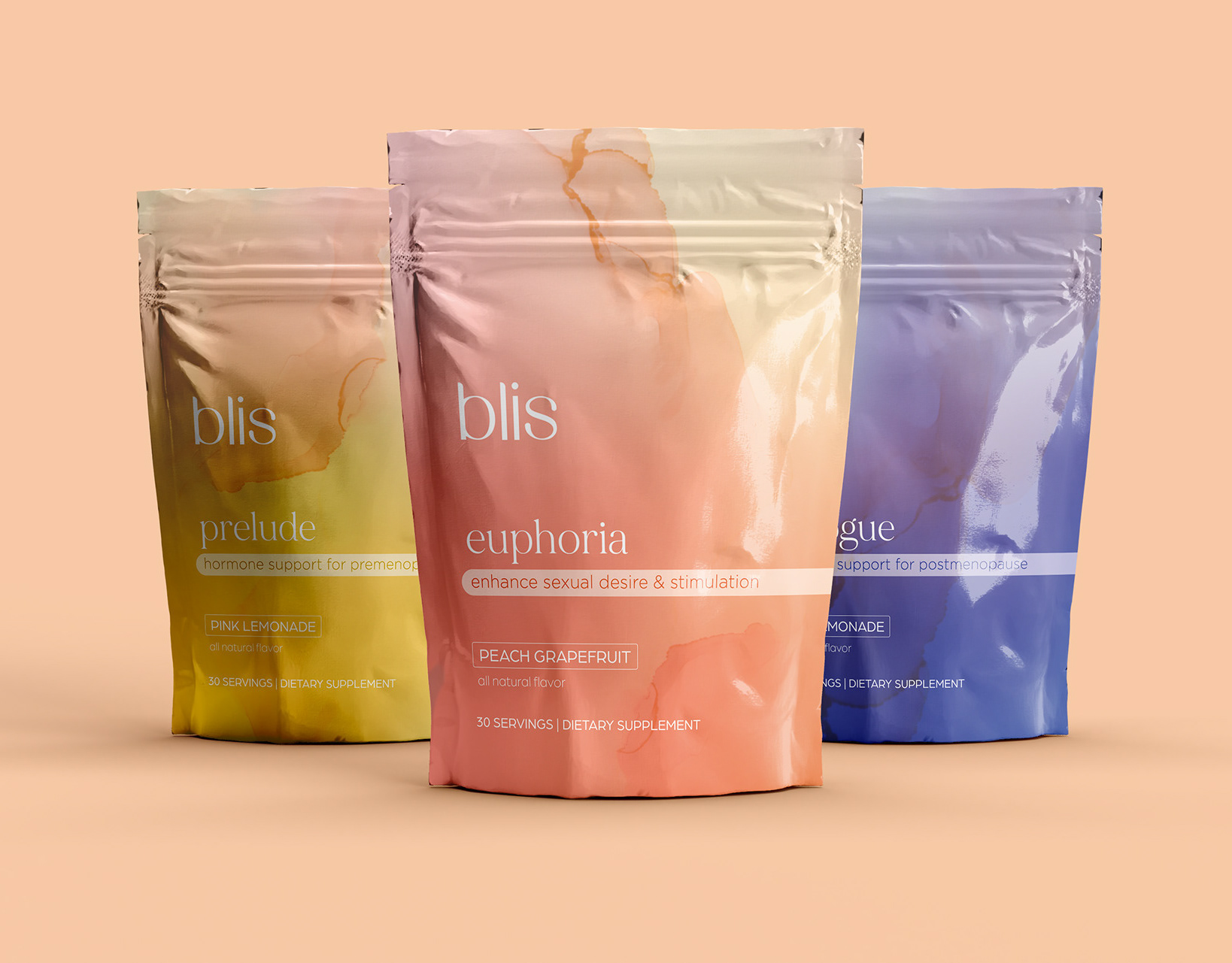
Revise the current packaging to enhance its professional appeal. The previous design predominantly featured brown and yellow tones. However, the client's preference is to introduce more green elements to accentuate the product's natural and organic qualities, emphasizing the use of wildcrafted ingredients. The objective is to maintain a boutique-like aesthetic, steering clear of an overtly retail appearance.
CREATIVE PROCESS
I approached this project with enthusiasm, driven by my genuine passion for pets and a personal connection to the product, having utilized it for my own dog even before collaborating with the client. Deliberately opting for darker shades of greens, my aim was make the this product feel more sophisticated and diverge from the typical vibrant colors associated with retail environments. Incorporating imagery of joyful and healthy pets, complemented by a subtle herbal motif, I aimed to convey that this product was a 100% natural product that consumers could actually trust.

